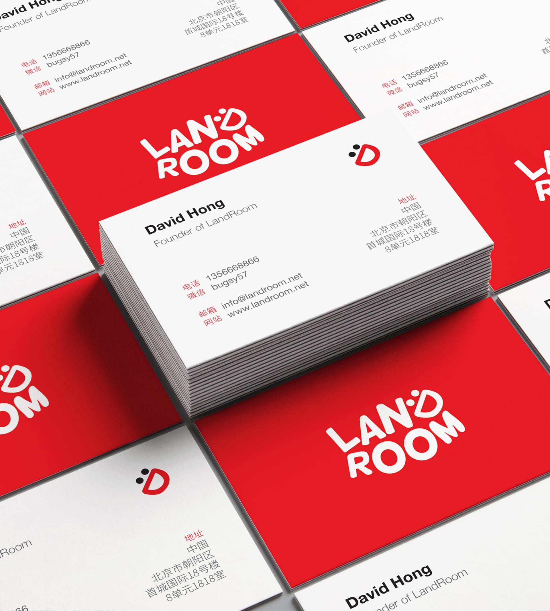
Landroom Logo and Visual Identity
- 2017
- Graphic Design
- Logo Design
- Visual Identity
- Branding
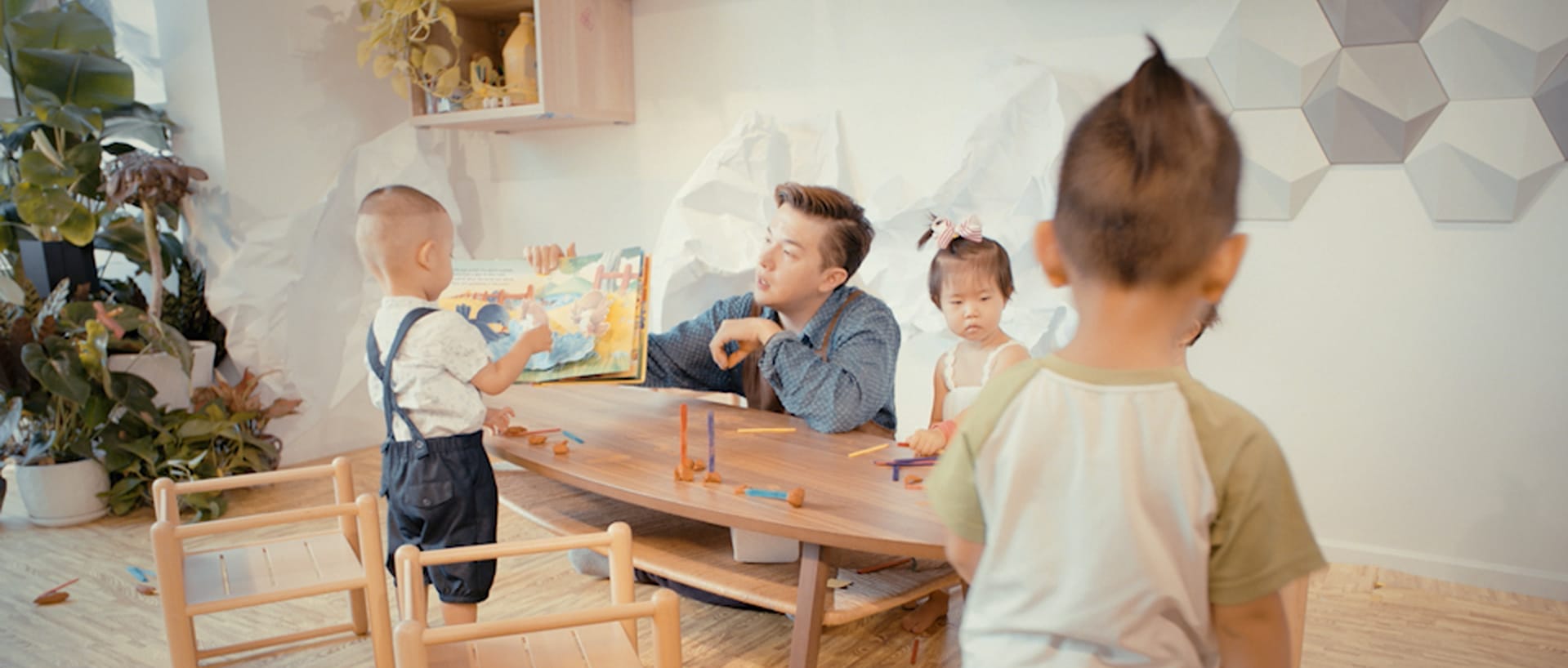
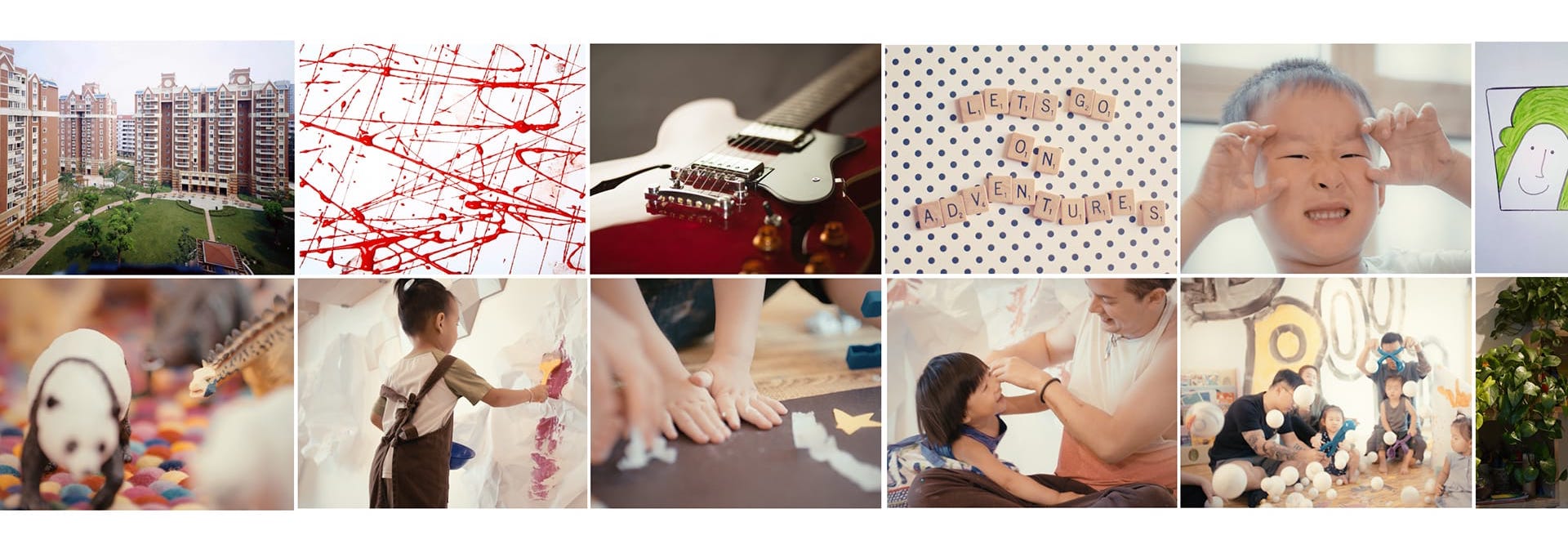
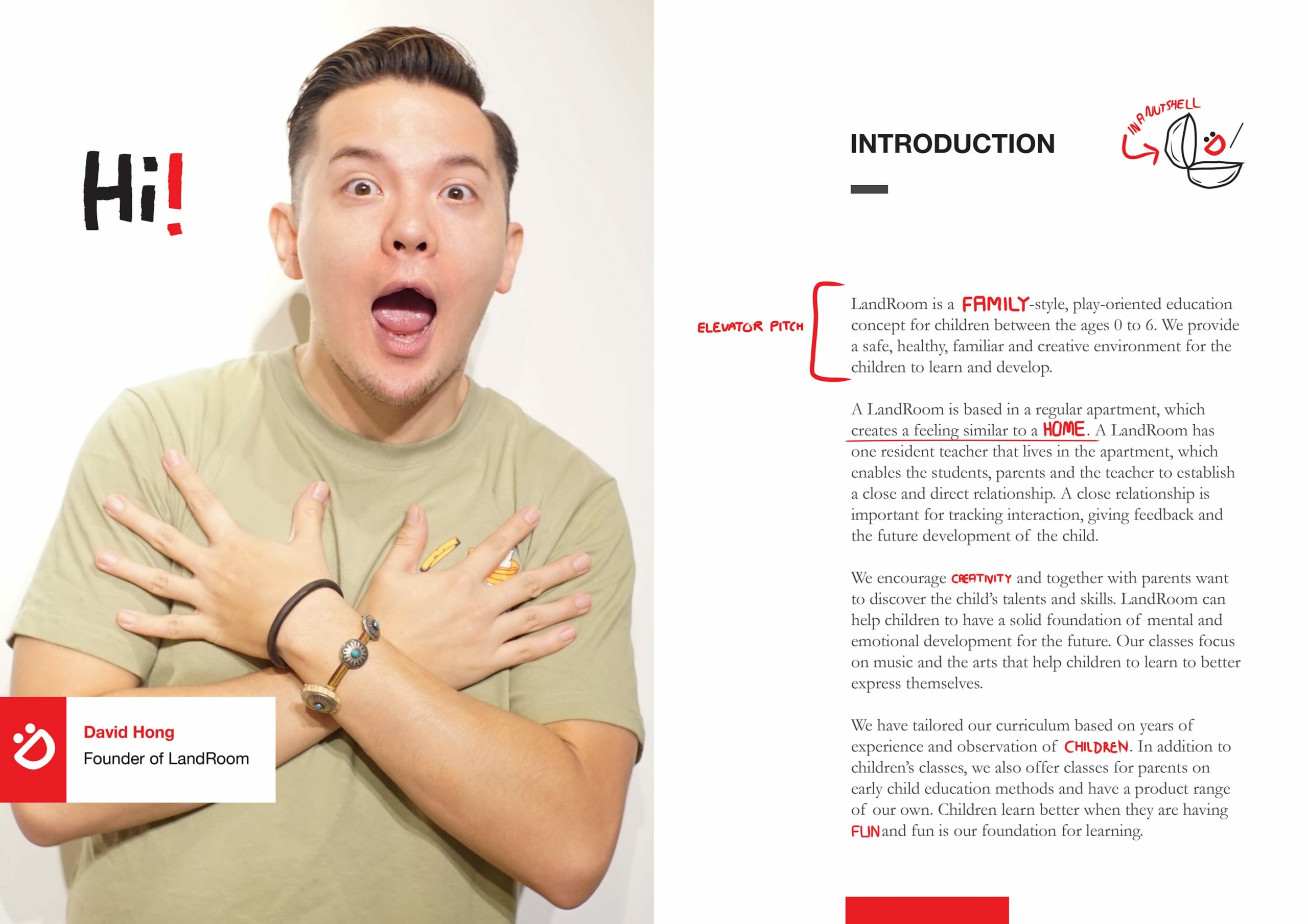
Landroom is a family-style, play-oriented education company based in Beijing, China. It focuses on early child education (ECE ages 0 to 6). Landroom rethinks the foundations of children’s education by focusing especially on music and the arts, and providing a unique environment – the atmosphere of a home. Listening skills develop faster than speaking skills, thus the arts, music and the perception and emotional delivery of sounds are a central part of Landroom’s curriculum. Interaction with music and sound help the children to learn to better express themselves and interact in the society. Landroom puts great value in creating a safe, healthy, creative and nurturing environment for children to develop.
“Children learn better when they are having fun and fun is our foundation for learning.”
Approach
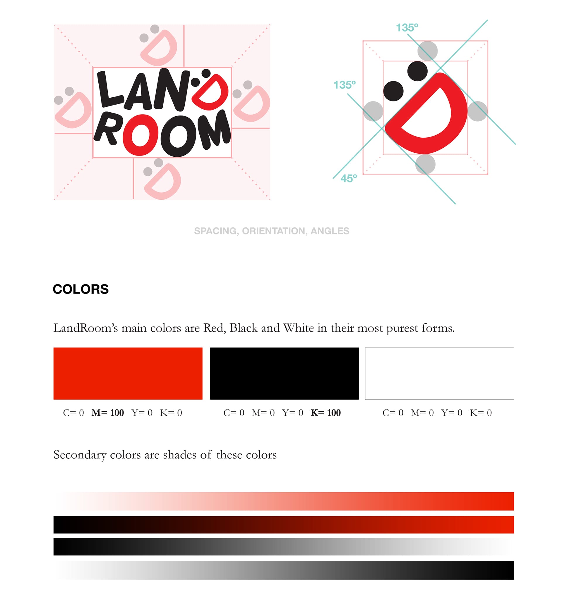
Fun, memorable, sweet and to the point – something the children and parents both could find appealing. Children are between the ages 0 to 6, and their parents in their 20s and 30s. “Fun” was the main keyword, though “fun” can mean different things to different people and there are also different kinds of fun. “Happiness” is also fun, and Landroom radiates happiness. Colors should be bright, clear and warm as Landroom is play-oriented with a home-feeling. At the end of the day, Landroom is an educational entity, so portraying a good example for the children is of most importance, not only from the visual side, but also from the communication and other activities.
Happiness, playfulness, professional.
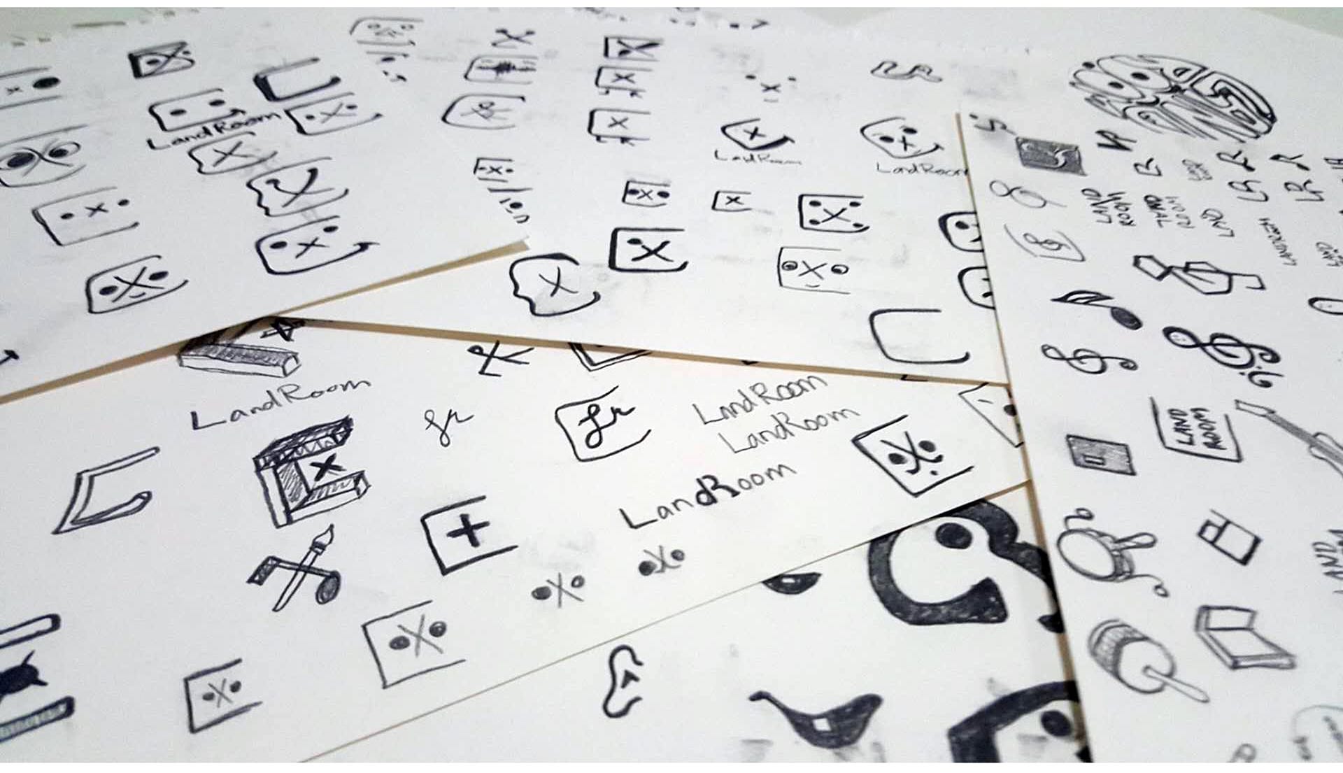
Exploring design directions
Initially the approach was to try to incorporate “community” and “home” to the logo, such as the Chinese character 区 in the logo to indicate LandRoom being part of the community. This approach wasn’t giving the happiness feeling that was a priority. Therefore, the next iterations focused on fun and music and coming up with final three possible approaches
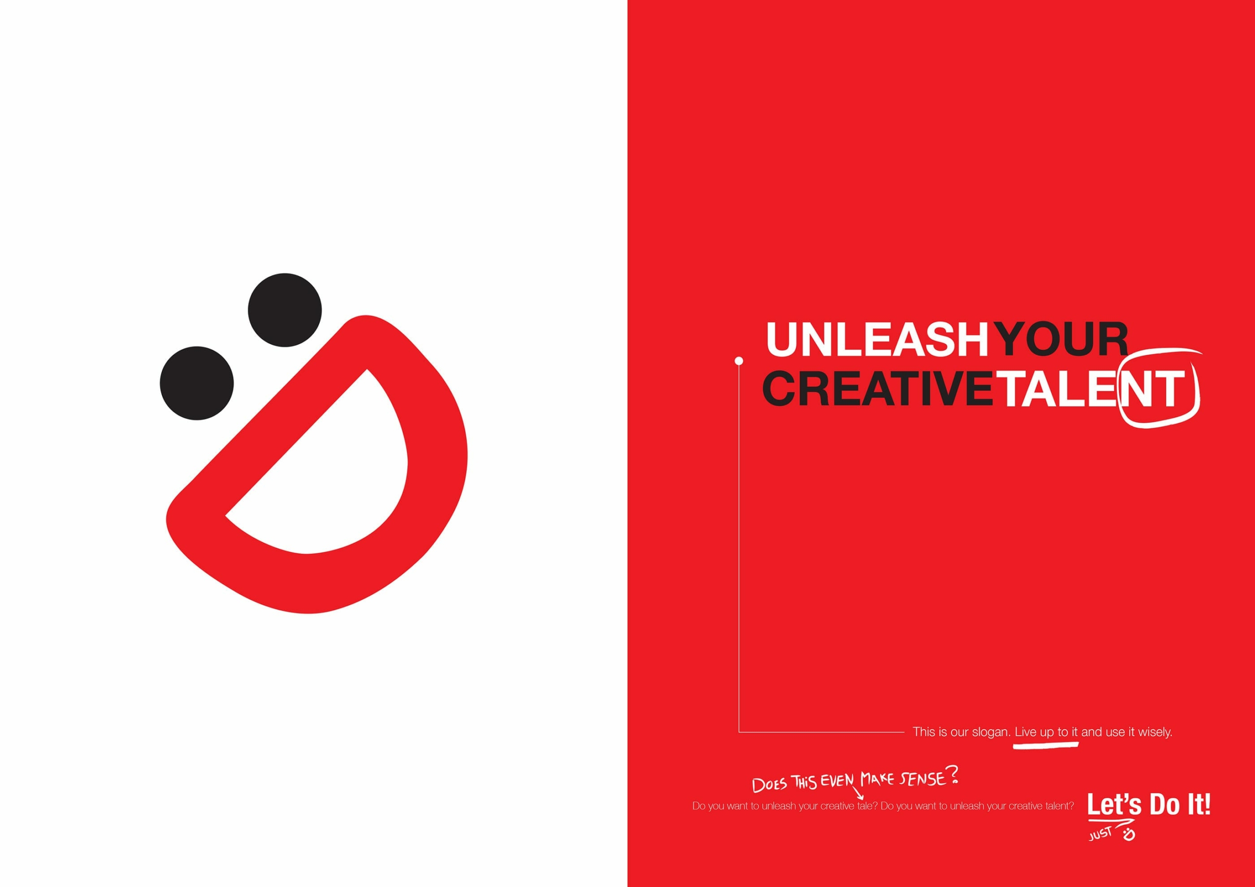
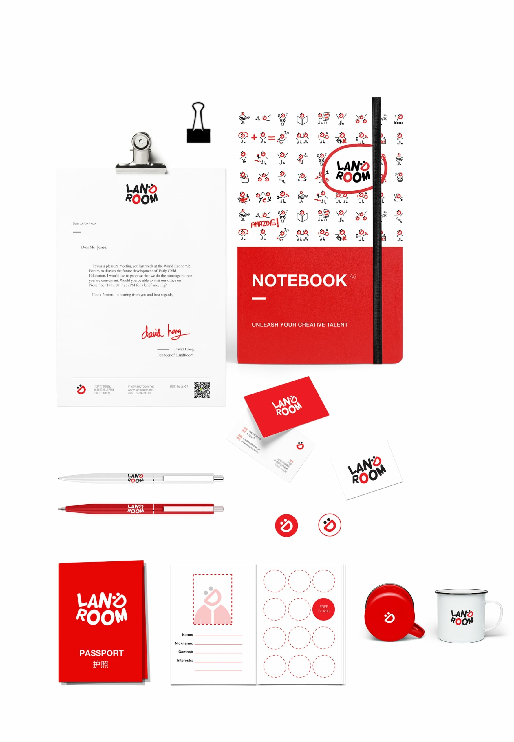
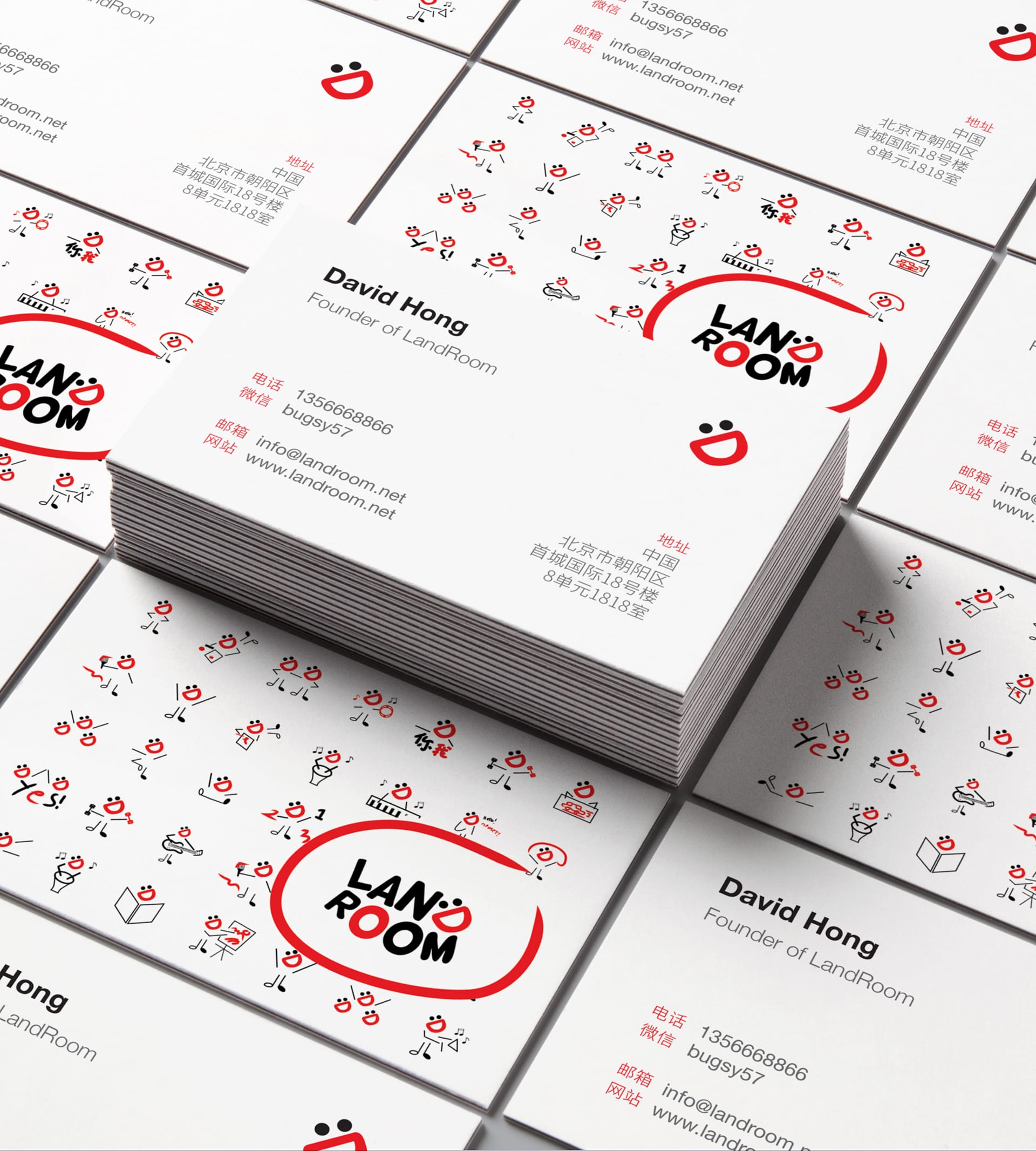
The chosen concept was “:D”. This new approach provided new ways on how the logo could be used as part of the visual system. The logo had a lot of flexibility. It was happy fun and playful.
