Flora Soap Packaging
- 2018
- Packaging Design
- Graphic Design
- Branding
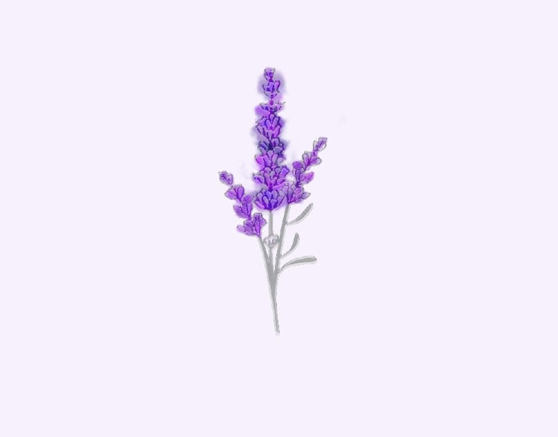
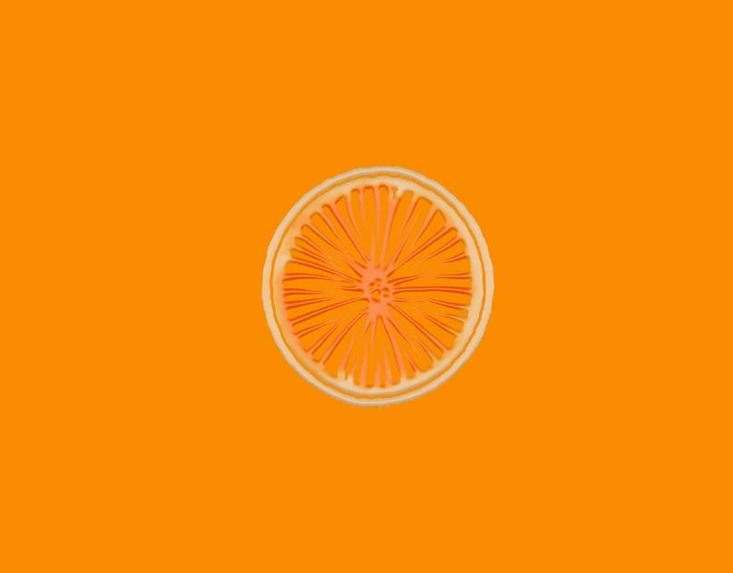
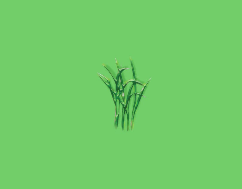
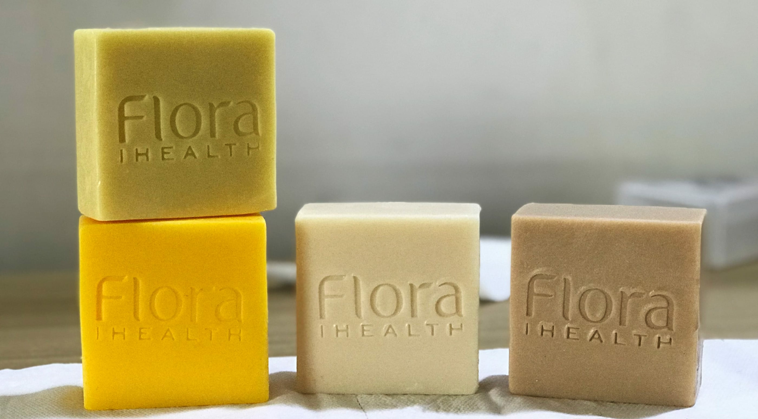
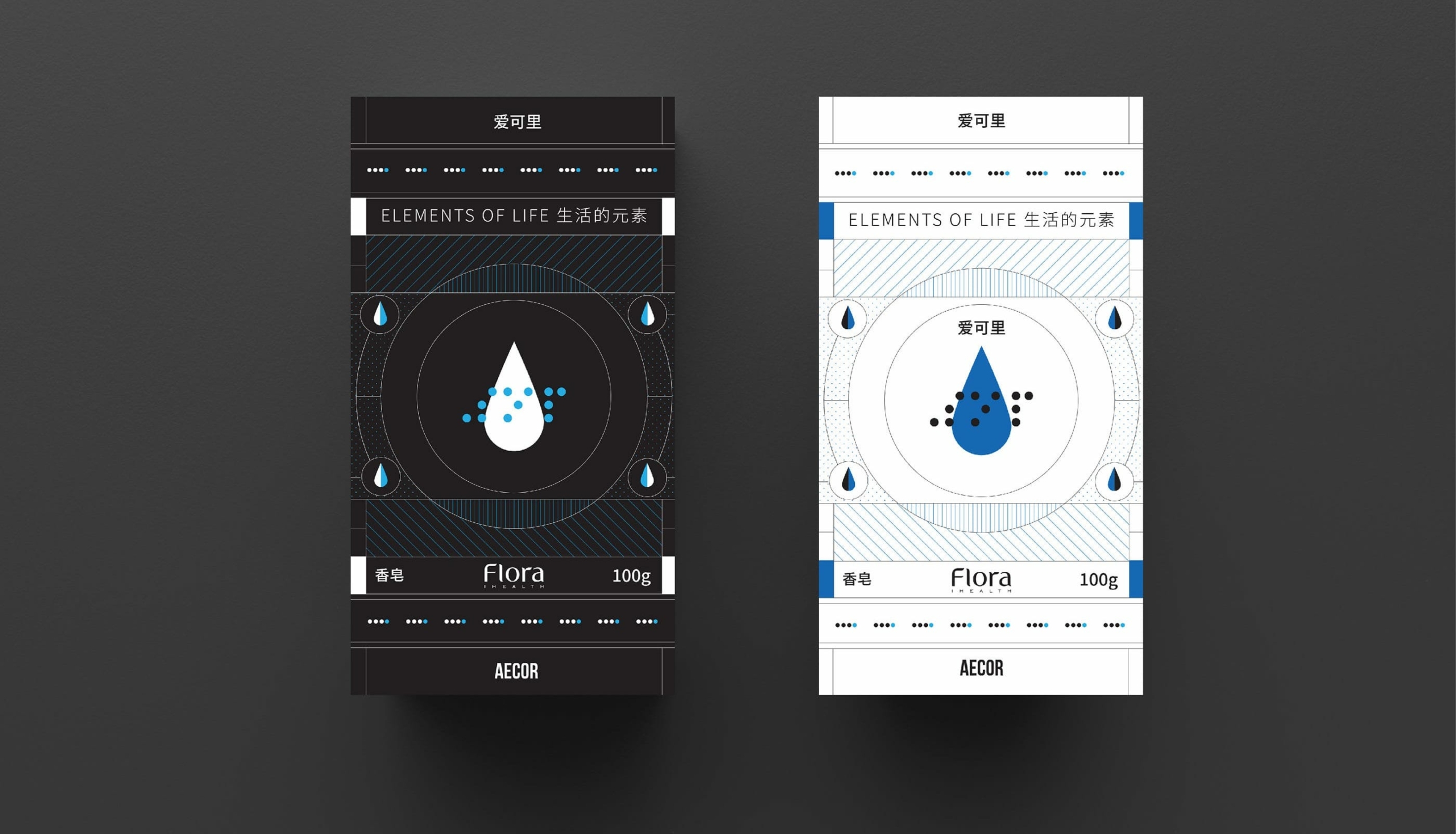
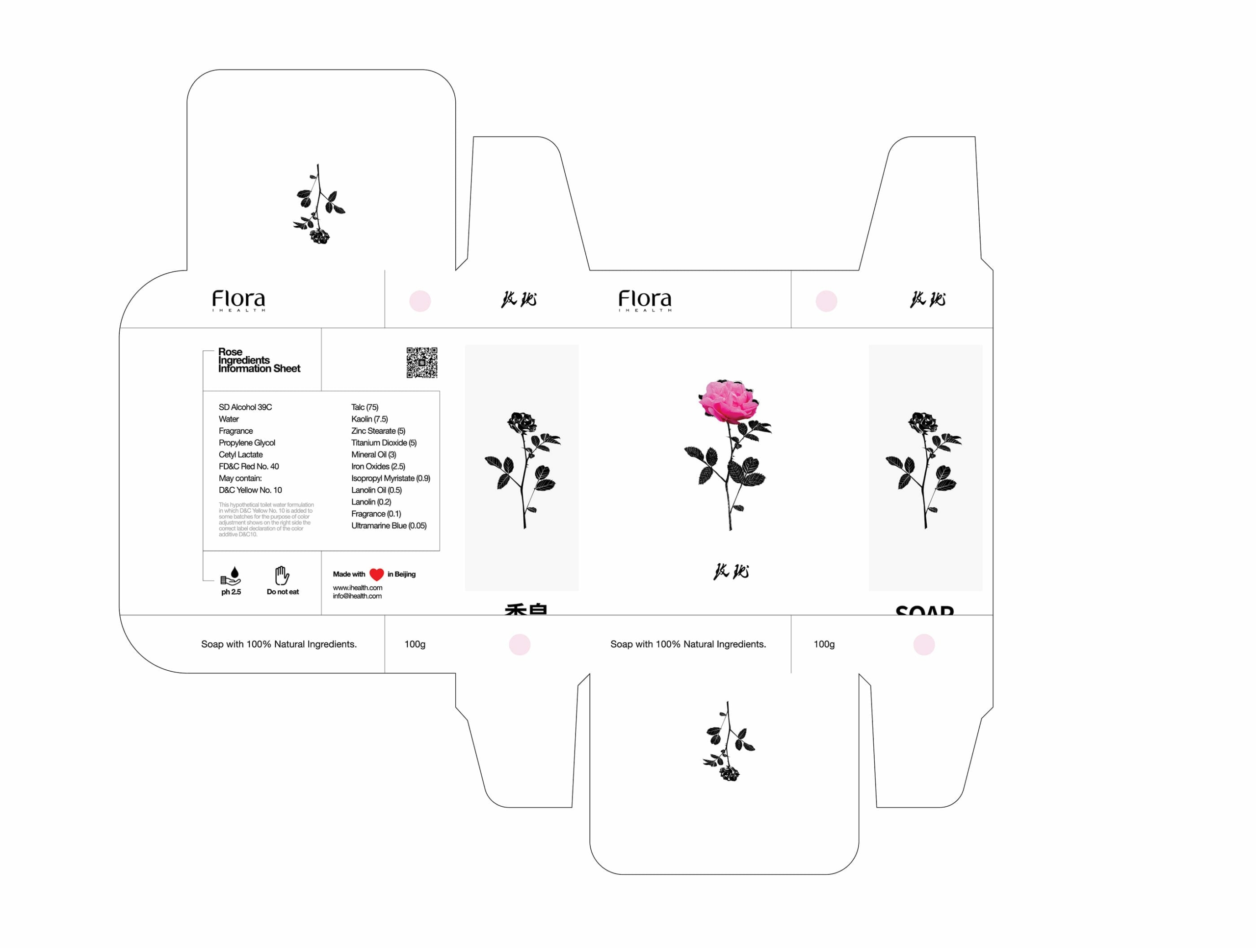
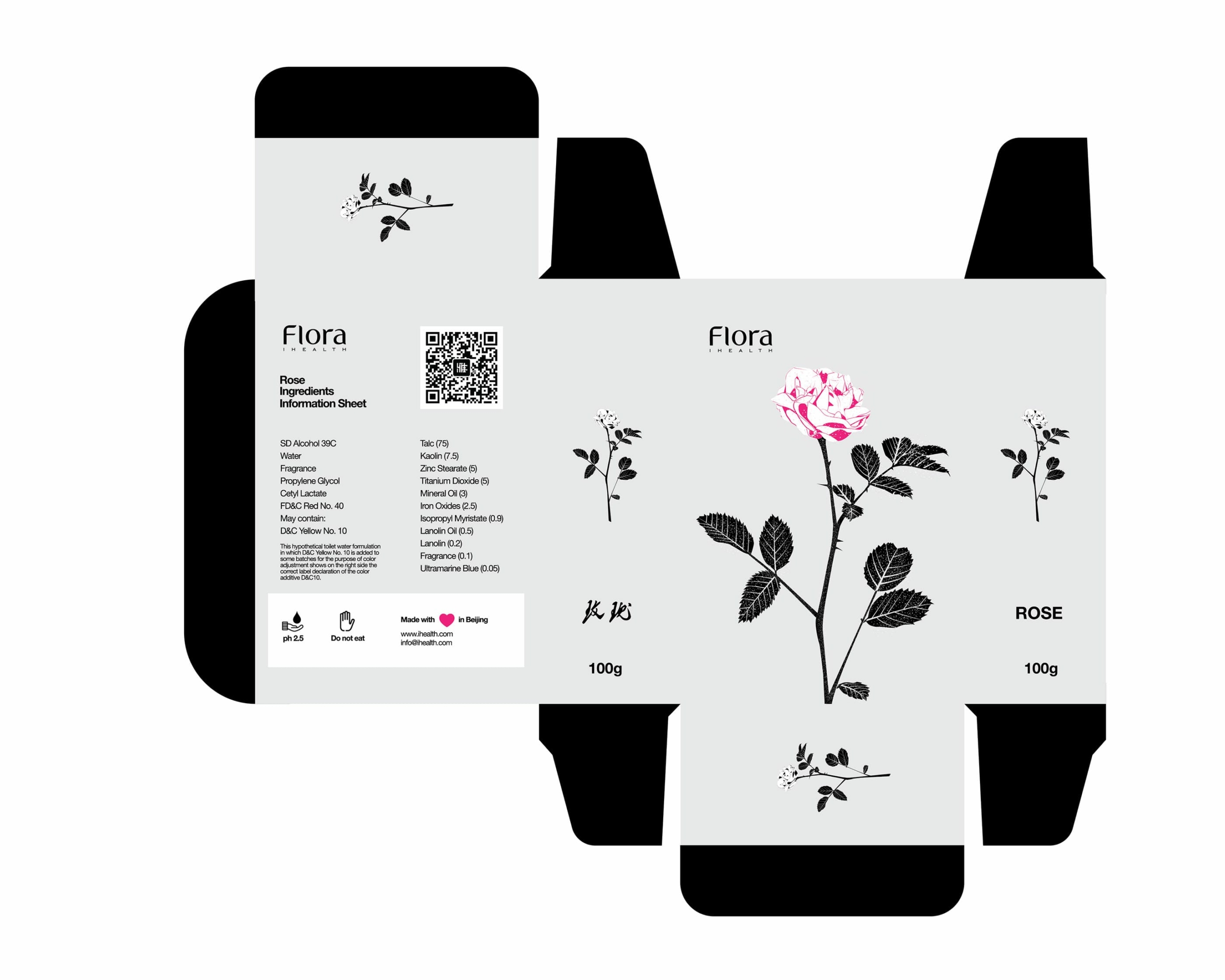
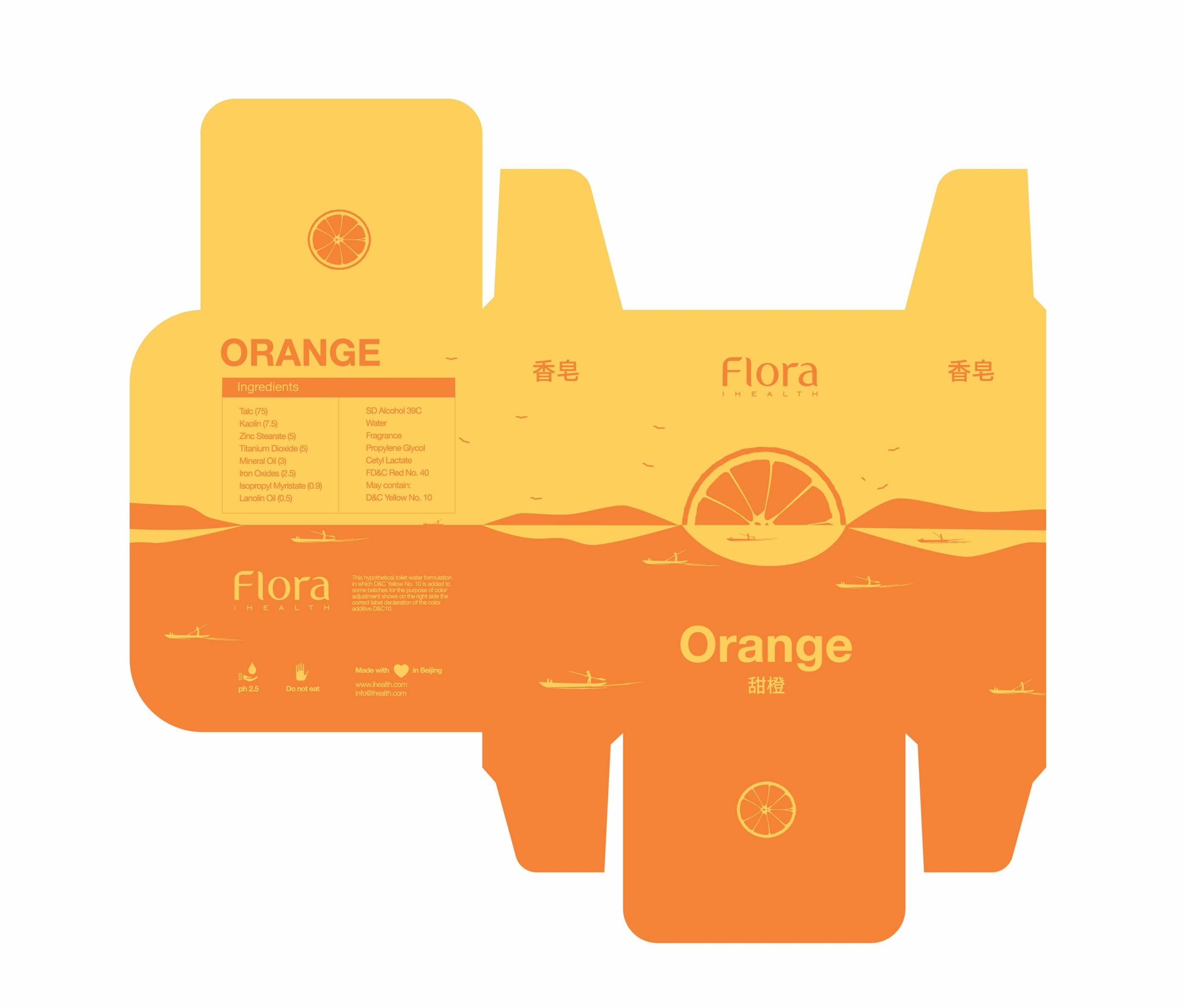
Essential oils and flavored soaps. Flavors include Sweet Orange, Lavender, Geranium, Lemongrass
Brief: Highlight the flavor, origin and colors in clear manner. Each item should tell a story
Approach
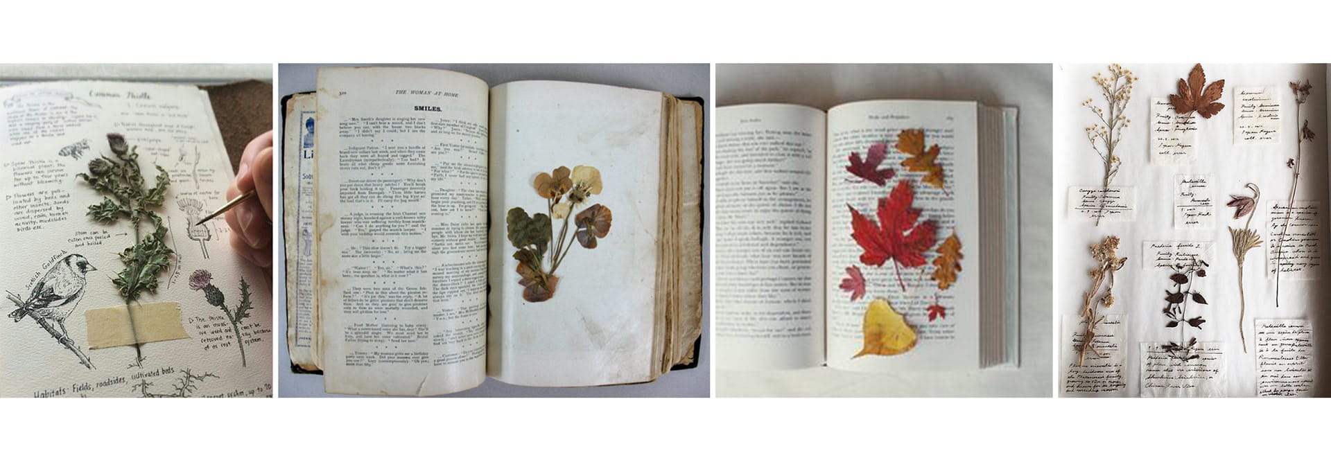
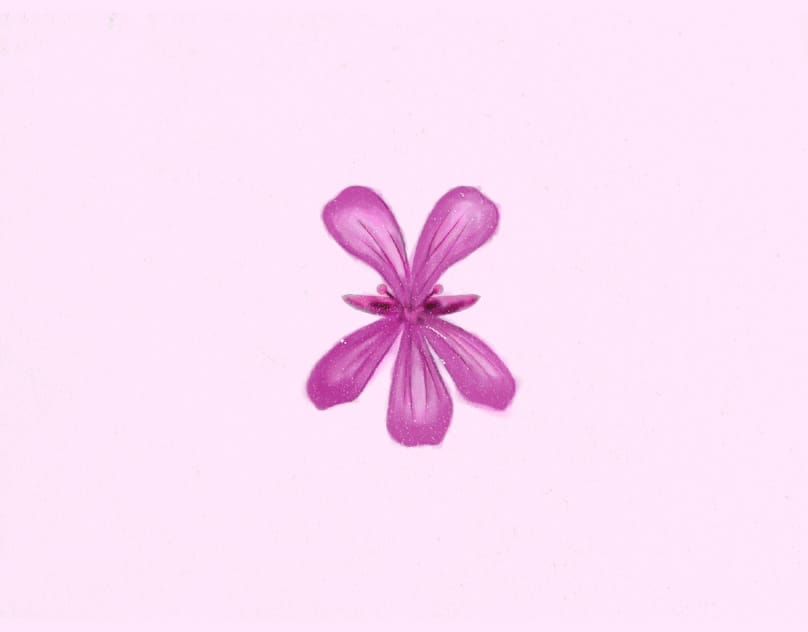
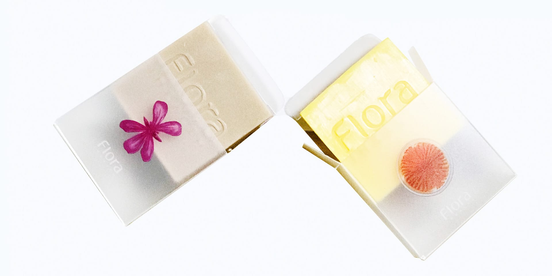
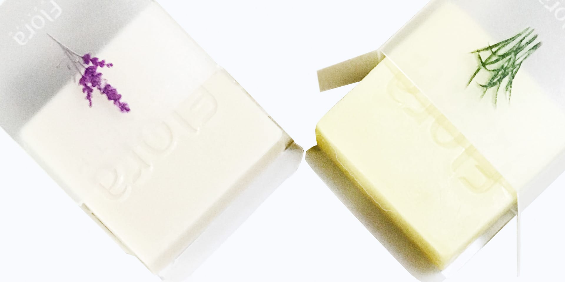
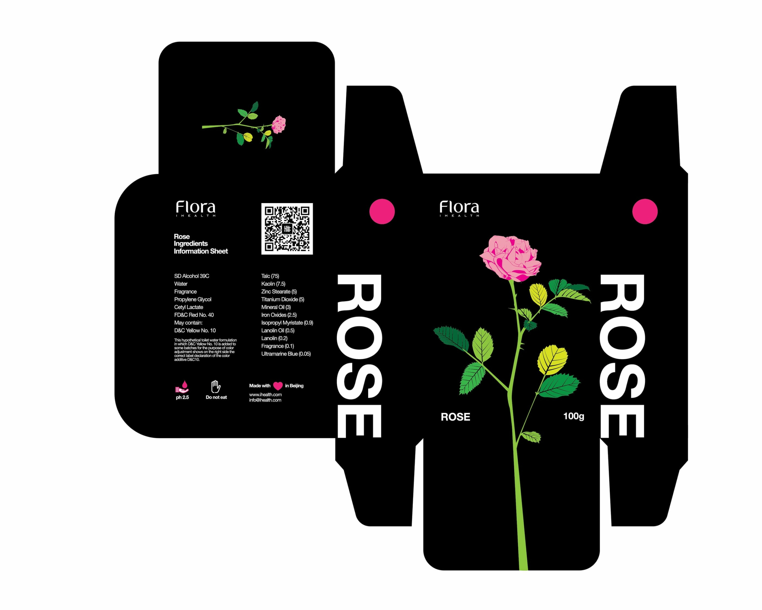
Pressed Leaves, showing the beauty and longevity of plants. The ingredients are the main focus visually, but the packaging should also have a touch sensory experience. Hand-made soap has a craft to it, thus the visual approach was to go with a drawn/hand-painted style, where you can see hints of the brush strokes, giving it a more artistic feeling. Touch element was accomplished with print technology by creating the shapes of the ingredients and embossing them, lifting them up on top of the design to let the viewer feel the shapes, as if they were looking and touching a pressed leave (though in this case, the plant is not fragile, and will not break). The packaging material used was semi-transparent, blurred packaging, embossing using the base color.
Packaging material
Emboss shape design for touch. Design also applied as the base for the visuals.
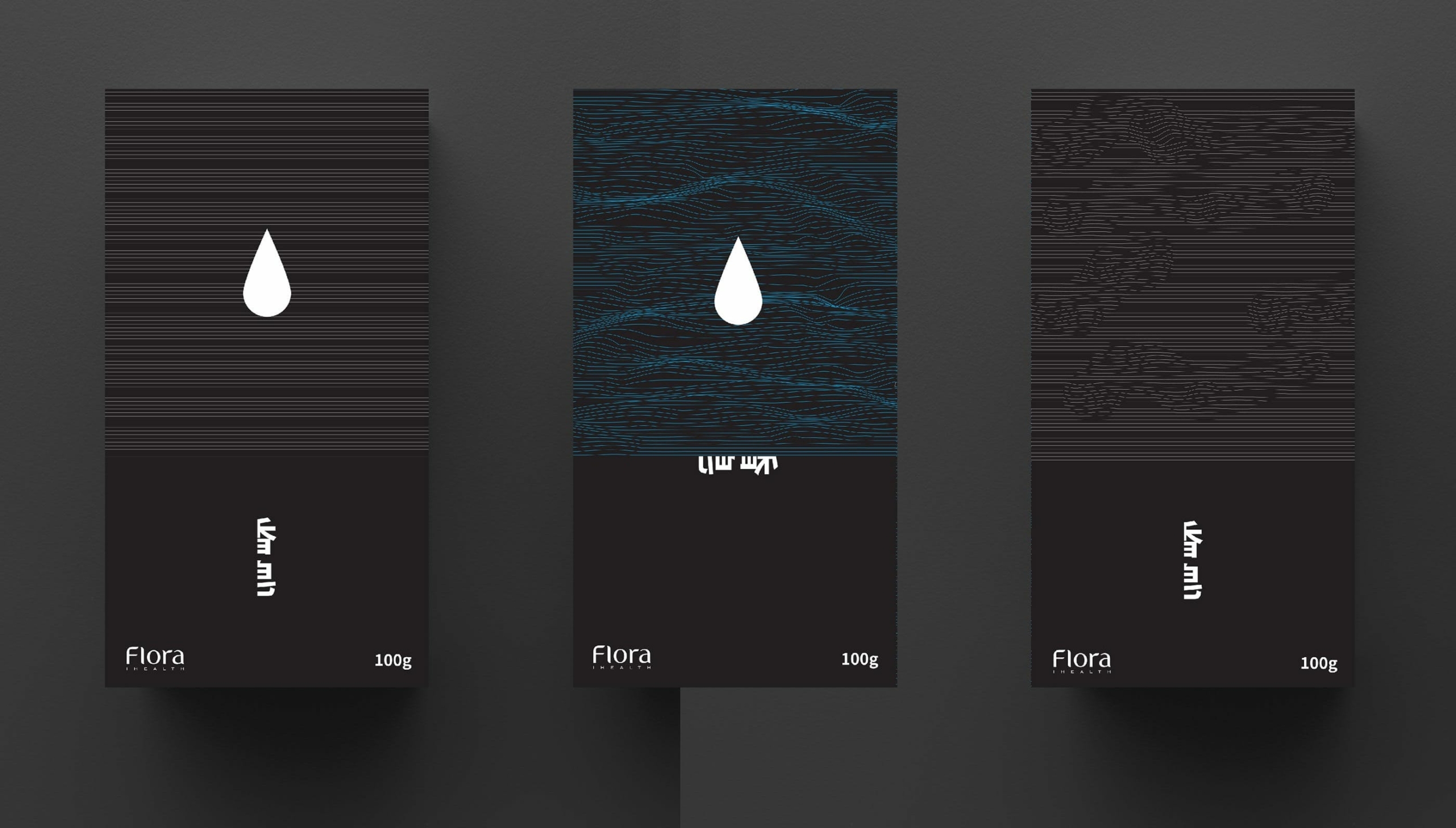
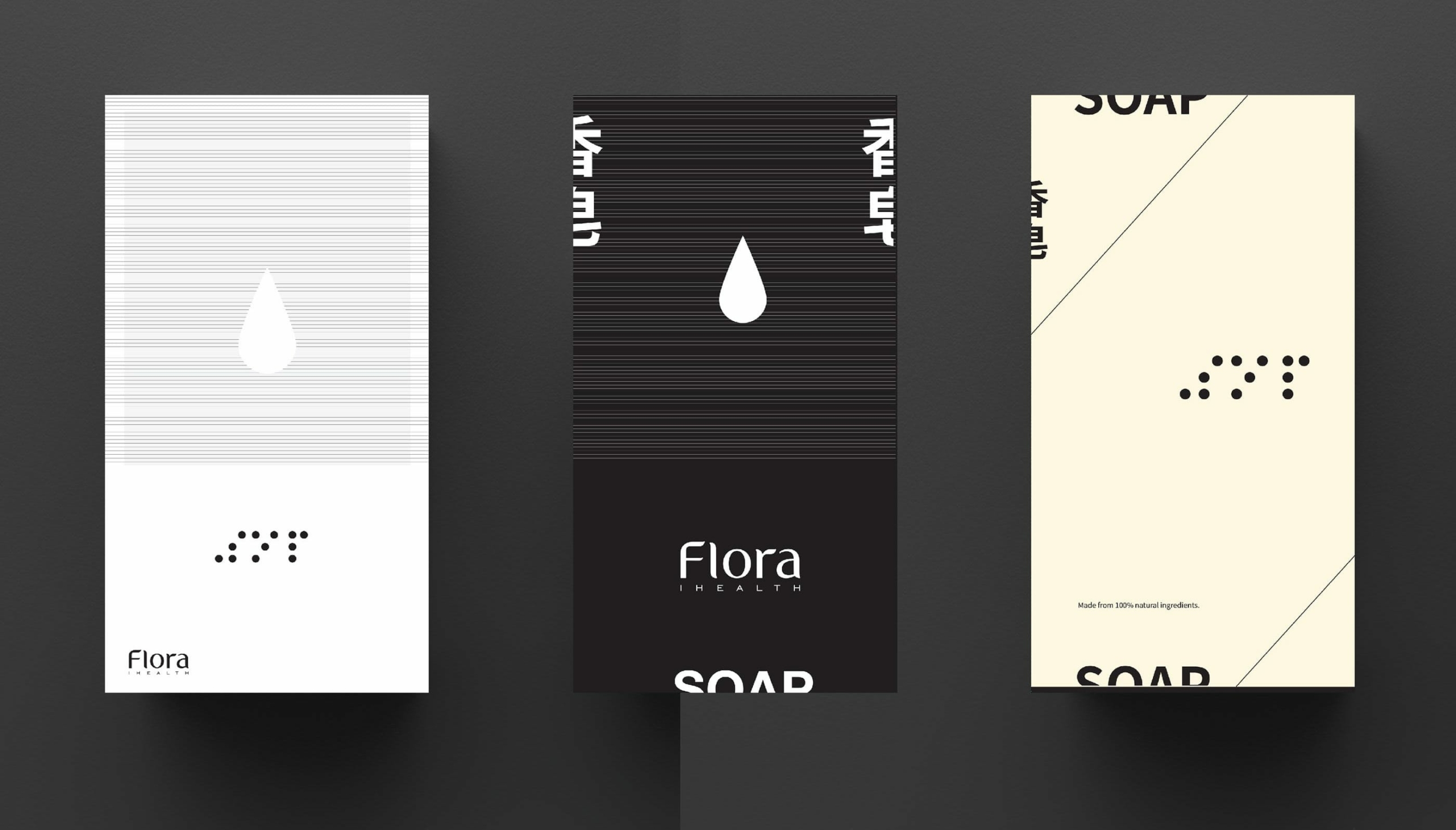
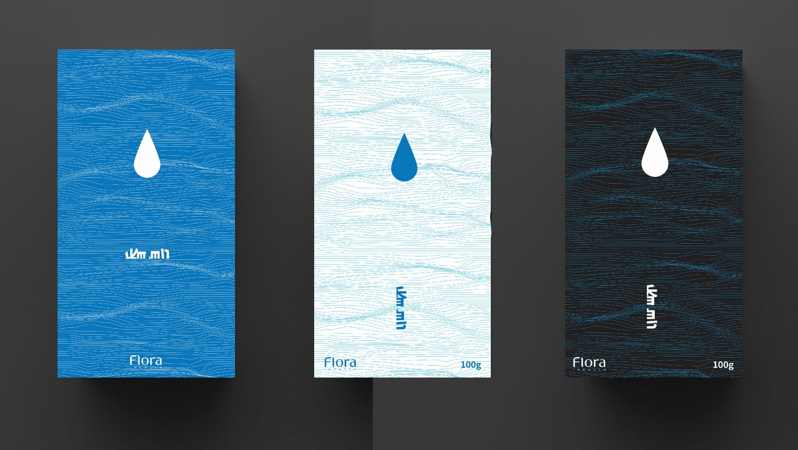
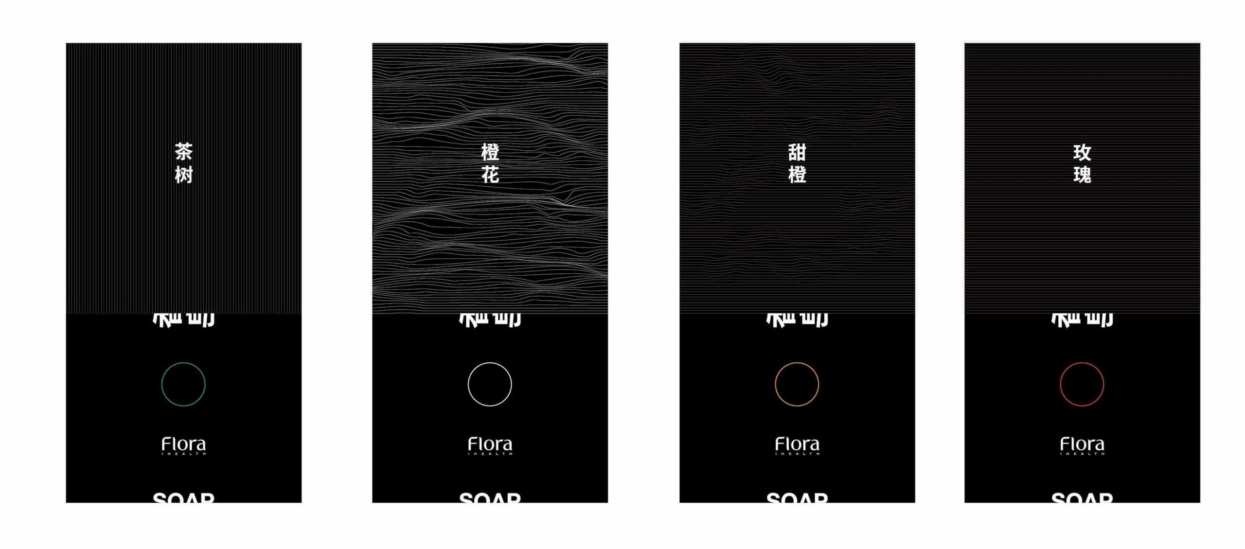
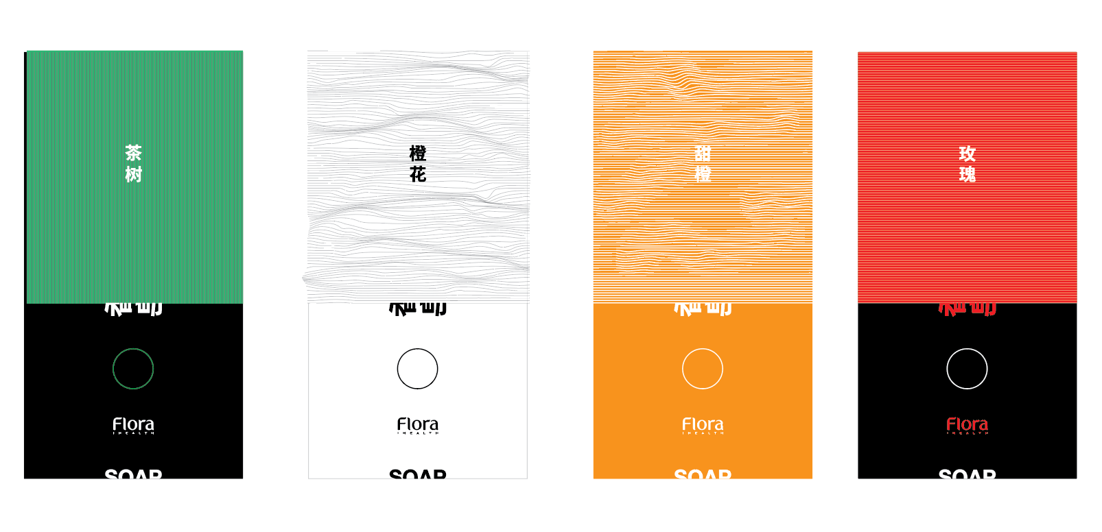
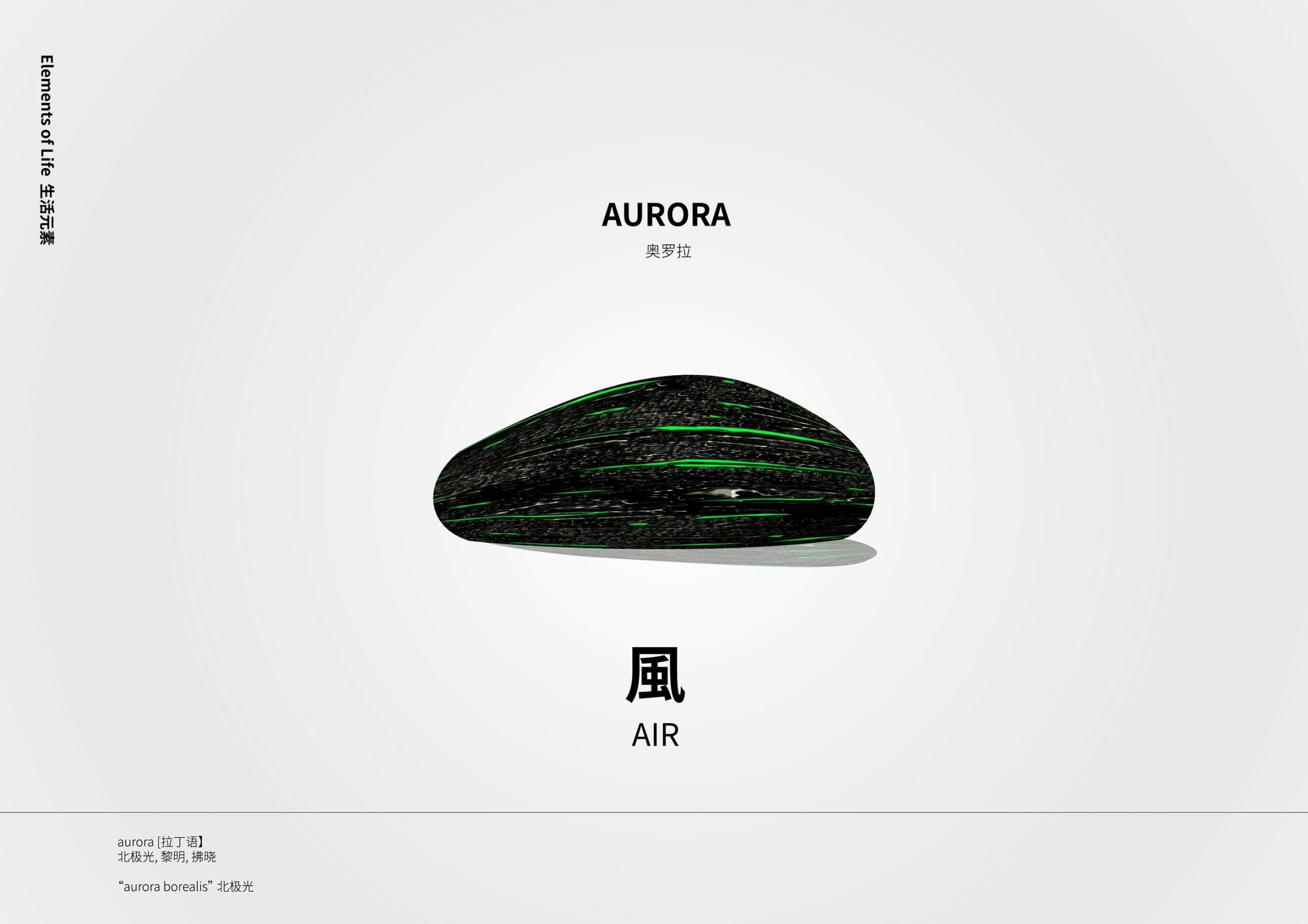
Other concepts

