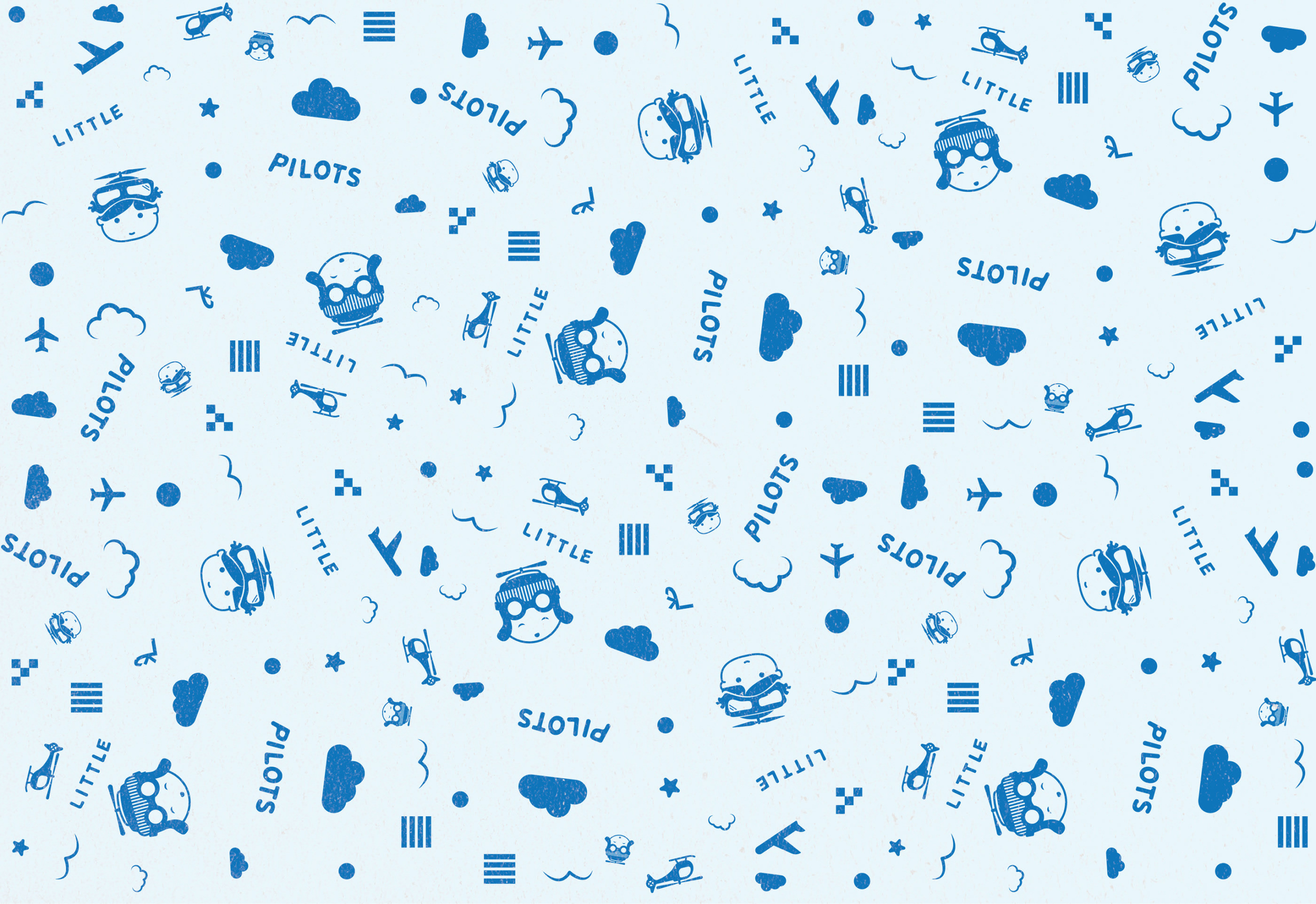
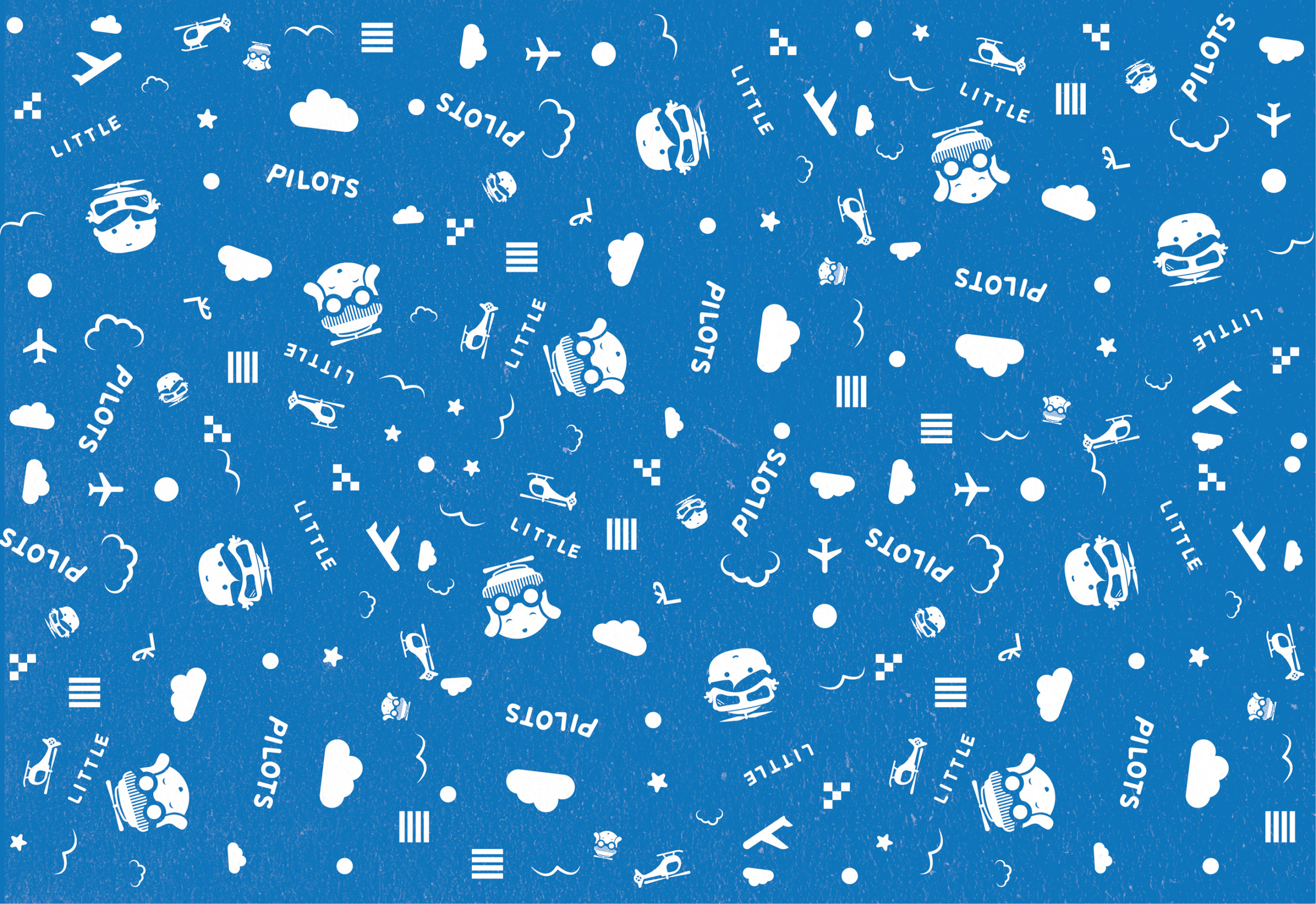
Little Pilots Logo & Visual Identity
- 2019
- Logo Design
- Graphic Design
- Visual Identity
- Illustration
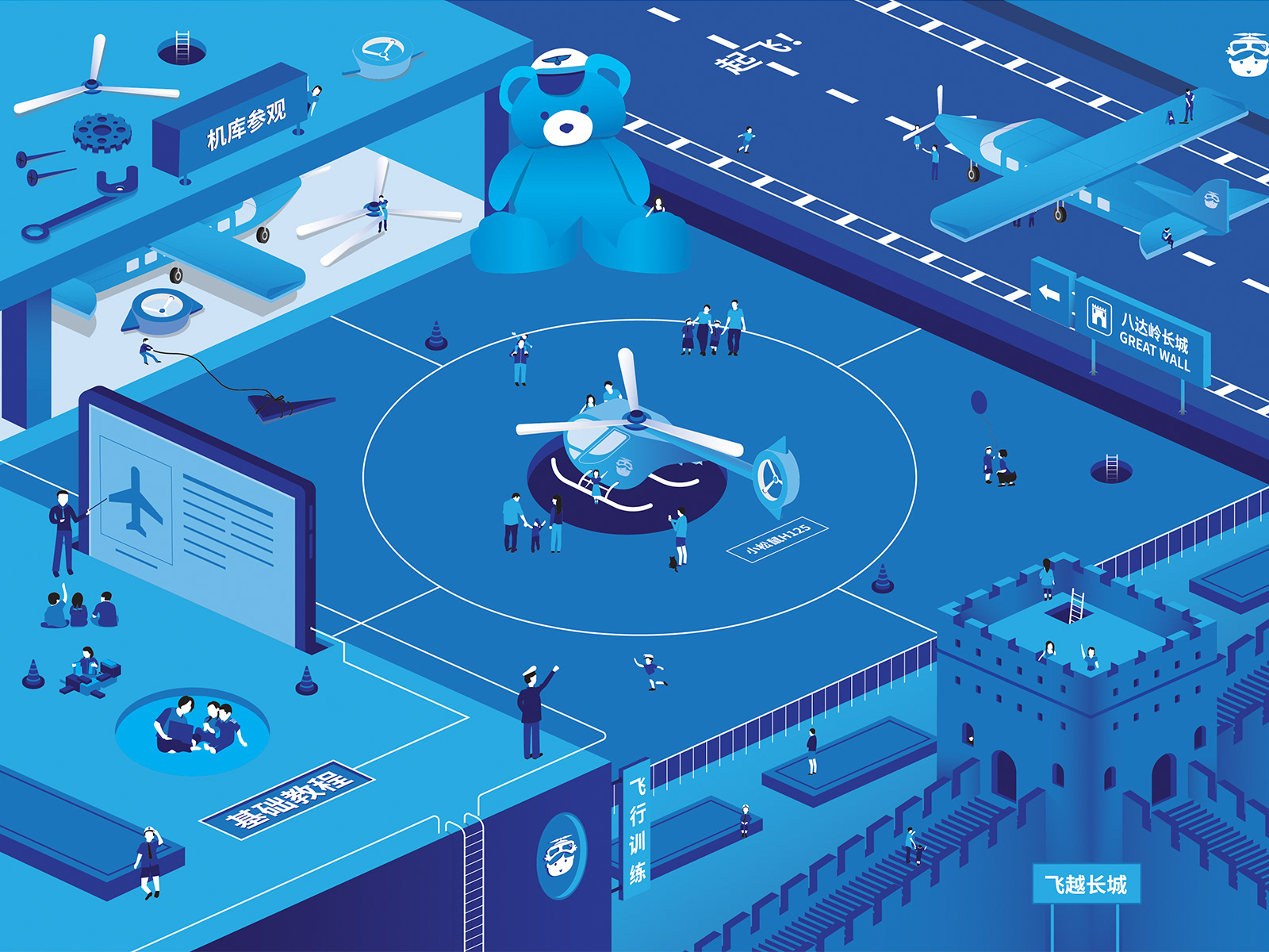
Little Pilots arranges a variety of flight courses, game activities and flight experiences for children. The goal is to provide children with a good grasp of flying knowledge in a fun and happy atmosphere. The idea behind Little Pilots is to let the children familiarize themselves with various aspects of aviation at an early age. Build curiosity at an early age and go on a journey to experience the blue skies, lands and views from different low-altitude perspectives. Realizing dreams.
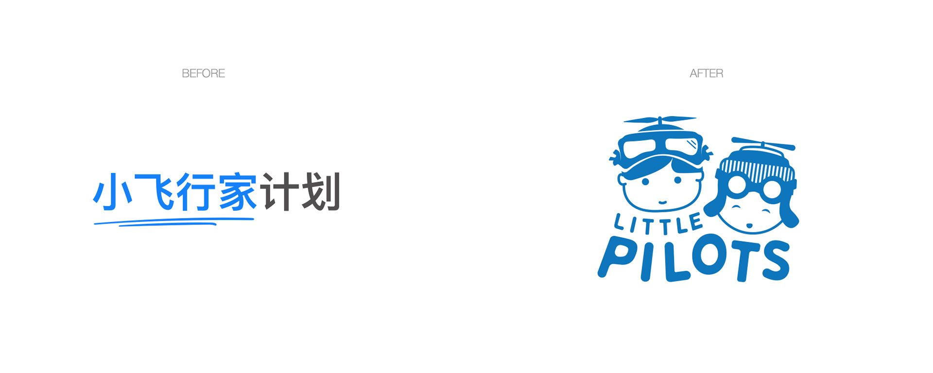
小飞行家计划
小飞行家计划通过一系列的飞行课程,游戏活动以及飞行体验, 让孩子们在欢乐的氛围下轻松掌握飞行知识,寓教于乐。小飞行家的初衷, 是想让孩子在幼年时期就真正的触碰到飞机。 种下一颗飞行的种子,让孩子与蓝天触手可及, 也从不一样的低空视角俯瞰大地的万物生灵。
Task
Create a new logo and visual identity for Little Pilots that appeal to children and their parents. It should be related to aviation, children and fun/happy times.
Approach
Initial analysis insights (as keywords here): Helicopter, Kids, Fun, Blue Skies, Boy, Girl, Pilot, Cut, Vintage
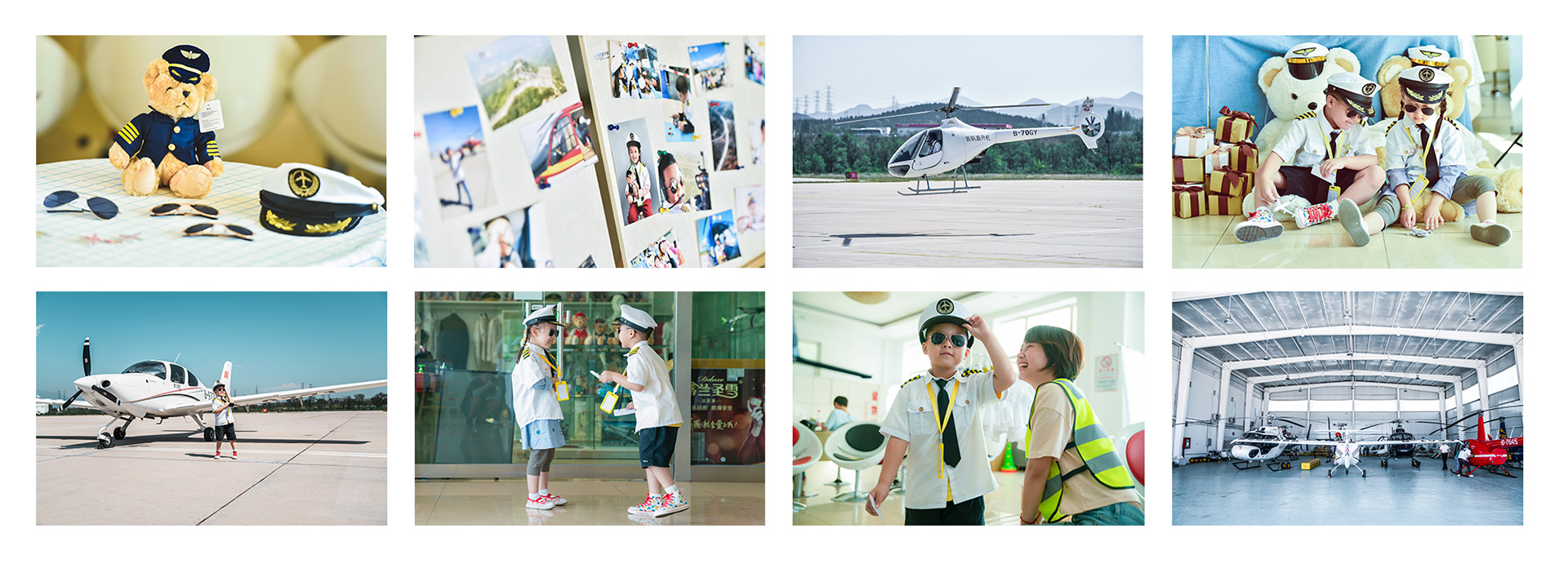
Onsite inspiration
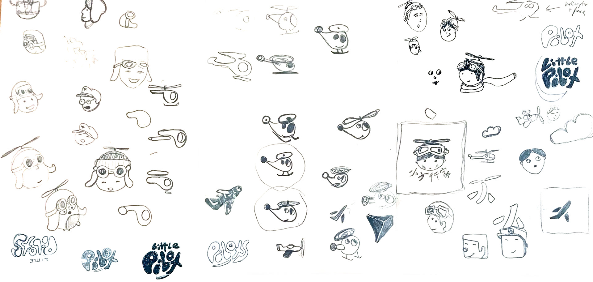
Initial sketches
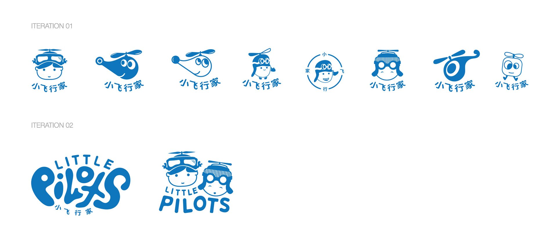
Initial concepts
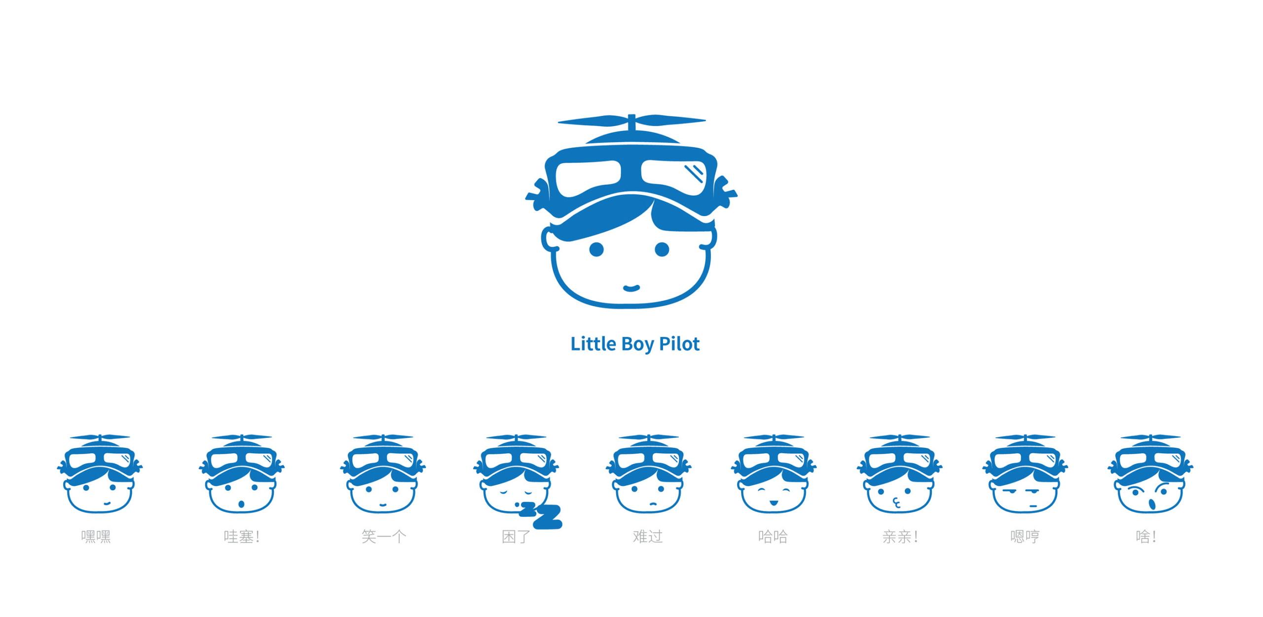
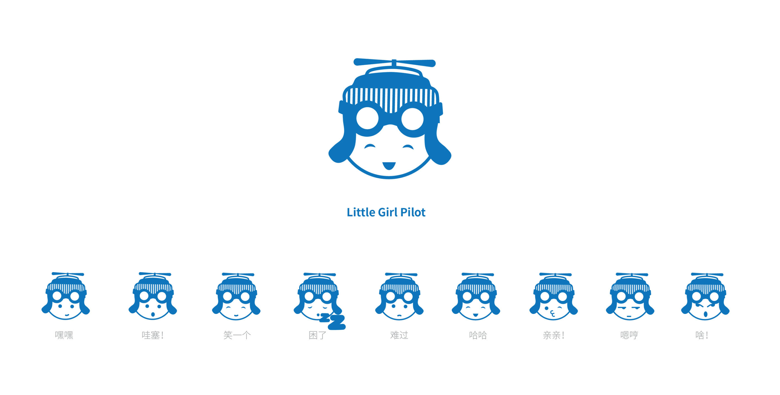
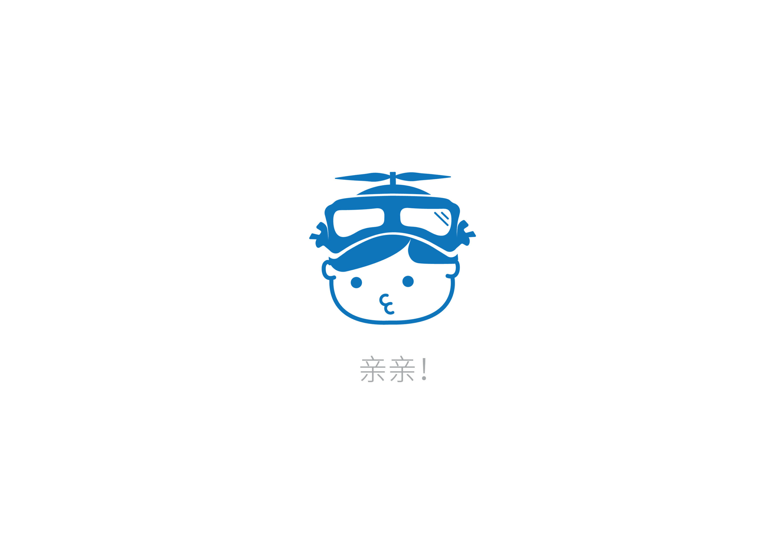
Decision was to go ahead with the two pilots (boy and a girl). The mark represented the core idea in the desired way; including two kid pilots (a boy and girl) with playful “helicopter” hats that communicate the focus on helicopters/aviation, as well as two vintage-style goggles that communicate better the idea of aviation than i.e. normal pilot sunglasses). It was cute, happy, memorable and a mark that could be easily translated into a larger visual identity/branding activities. It was time to re-explore and re-think the color scheme.
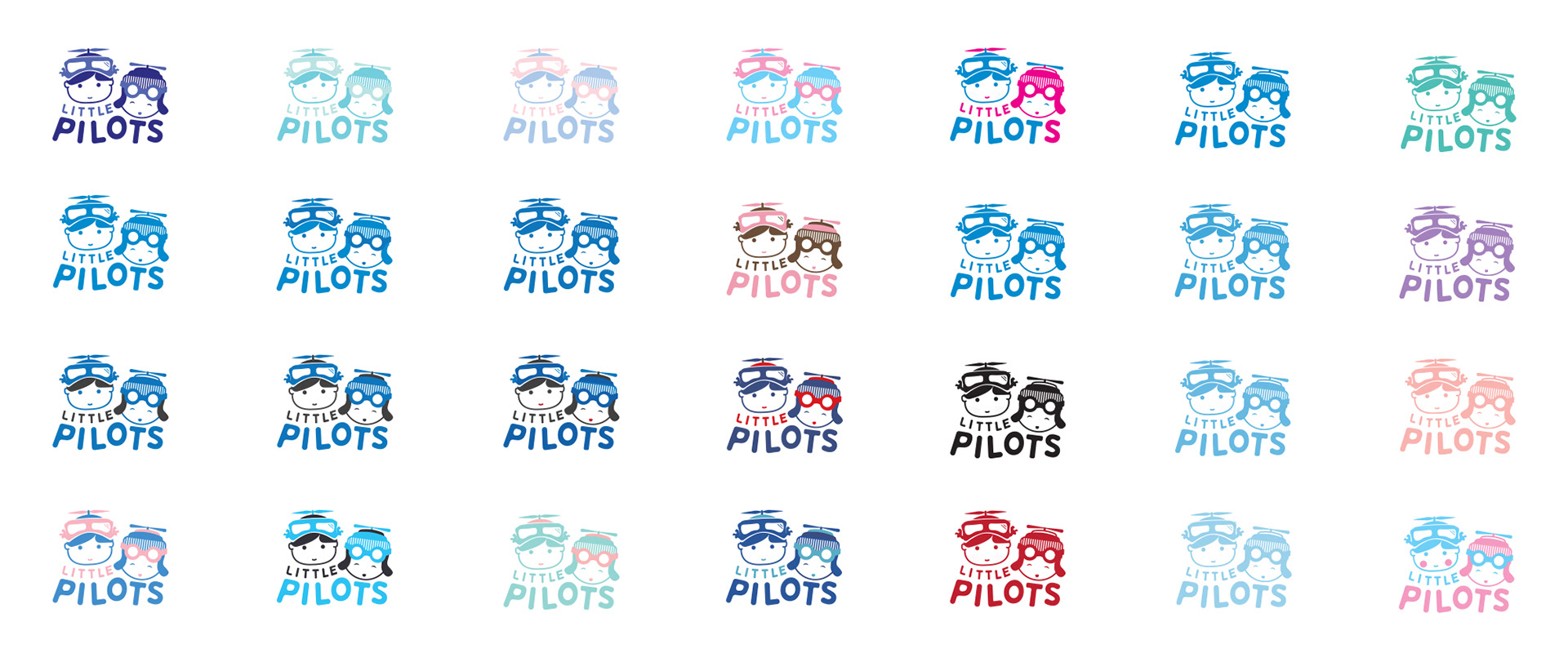
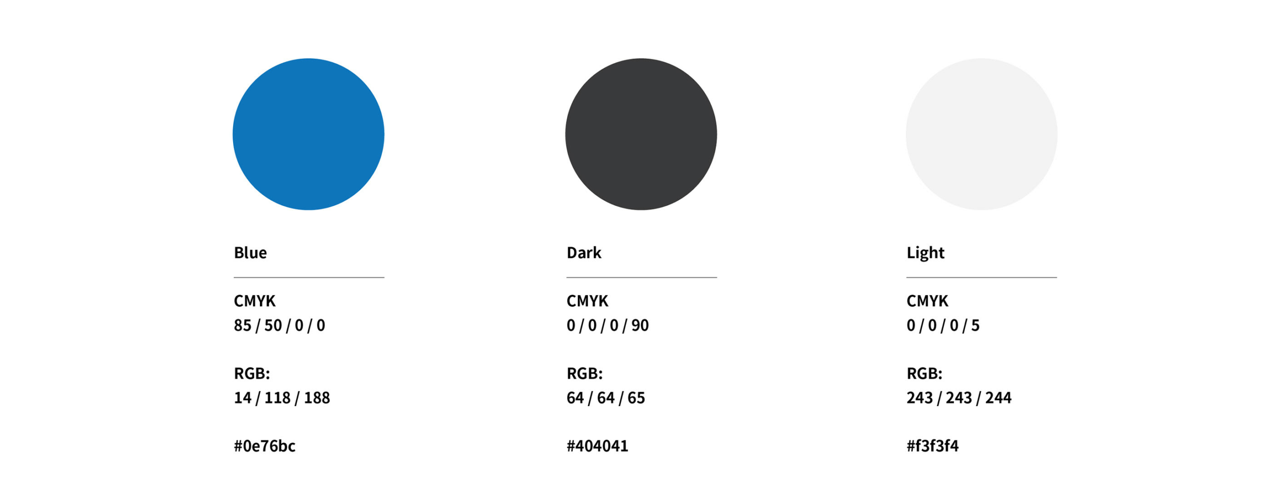
There were a lot of reasoning about going for a two-color (or more) option, lighter options, which could help to emphasize certain elements, such as “propellers/helicopter”, boy/girl, “children’s colors”, etc. However, in the end going with a single color was an ideal direction due to the fact that it was most clear, no “extra decoration-feel”, blue representing calmness and knowledge/information(education), and blue as the blue sky initially communicated in the brief.
Final Logo
